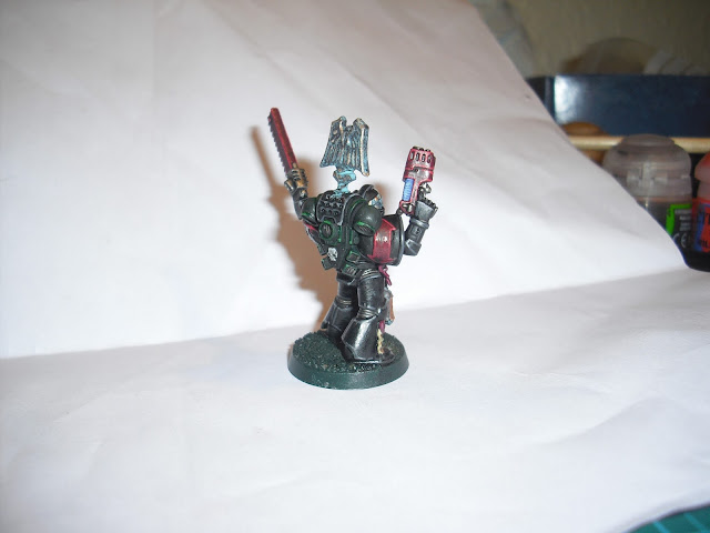
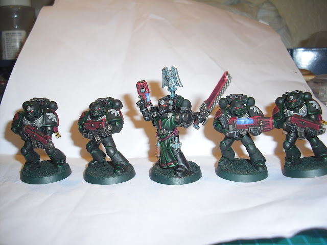
Last night I had a bad case of staring at the ceiling wide awake despite best efforts to enter the land of nod. So, enthused at 2am I got up and started to paint the veteran sergeant for my Dark Angels squad developing the colour scheme as I went along. As I discussed in previous posts and their comments, I wasn't sure how to style the robe section of the Dark Angel aesthetic as I dislike the traditional cream.
Below is my decision and I would absolutely love feedback on how this guy looks. I received an exciting parcel today from Anvil Industries with lots of goodies to make my first Inner Circle Veteran squad. The veteran sergeant below has not yet passed through the Rite of Unshackling and thus still has his arms aux natural as they say (possibly).
I plan to work on these and my idea for thematic basing over the weekend and get something to you lovely people to peruse. Tonight I'm playing my final narrative game at 3000 points so it should be a doozy! Expect the report on that late next week along with plans for further games.
Pictures!!
EDIT - A couple of pictures with no flash (I also apologise if anyone was offended by the background of these pictures before I cropped them for content)
Peace out,
Rob


He looks great, but I don't feel he stands out (colorwise) much from the tacticals.. Then of course, you have a better concept of the actual color shifts in person (I'm just going by the photos). Hmm when I adjusted the tones such, the black armor does make him pop quite a bit more!
ReplyDeleteThings to adjust (for next one). About half as much verdigis. It's a bit strong and overworked a bit (maybe try same amount, but thinned).
I love the lamp, it's flipping awesome. Eyes are good too!.
I did a quick test with him with a red cape to see what it looks like. I think I like yours better.
http://i.imgur.com/oG4PdW5.jpg
Thanks for the quick reply Greg! You are master of the Blogosphere! Making him not stand out was quite intentional actually, I'm aiming to make these dark and actually stealthy looking (relative to other marine chapters anyway) and so didn't want him to shout I'm a priority target in his colour scheme. Their bases will also be green foliage with darkened columns that they are creeping through in the ruined garden of a Hive in the upper Quarters. Think Biodome.
DeleteI'm not ashamed to say I had to look up verdigris :P looking back at the pictures I think you're right, though when I look at the mini it doesn't look half as bad :/ I took a couple of pictures without a flash to show you and added them in above, I definitely will be using less though on my other oxidised metals.
I found a guide that mentioned adding a spot of white into the eyes and I'm blown away by how much difference that makes!
That is seriously cool that you can do that man! I ummed and ahhed over red for the tabard but decided would be too stand out ish and would also match my Templars too closely, and bad blood and all that :P
Thanks again dude!
Sounds perfect Rob! Sounds like a good plan to me. Defining them as different, while still making them not stand out too much. Might suggest some fun with purity seals in the future, if a sarg is particularly good. Always fun to give them some purity seals as they perform heroic acts!
DeleteThere is a big difference between table top mini's, and comp mini's. What works on the table top is generally exaggerated, and what works in up close comp photos, is generally restrained. If going primarily for tabletop, or at least tabletop+/army comp in this situation, having extra patina (or verdigris) will show up much better at a distance.
Glad to help! They look great :)
I have a horde of purity seals building up for this very purpose! I've also not glued the head on too tight in case I want to take it off and put it on an inner circle model in the future if I gets promoted!
DeleteOh deary me no, I don't every expect to truly compete in a competitions painting category to be honest, there are far too many painters better than me and I just can't get some of the same effects down that an investment in an airbrush would bring. The aim with the Angels is too get to the nomination stage of the painting category which occurs in a few tournaments I plan to attend.
Other than that its just have as good a looking army as I can for people to enjoy playing against.
I look forward to seeing more Orky pictures of yours btw, I had a blast playing Orks yesterday with a hilarious result on the zap gun from a Mek too! Your a damn fine inspiration to many.
Thanks Rob! Orks might be on the back burner for a bit...i really burned myself out on them! Gotta paint some crons up next for my friends and do a bunch of bat reps :). Appreciate the kind words. I was amazed by the feedback on them at nova. Everyone really liked them, and people were begging to play them!
DeleteThat's an excellent first goal. Aim for getting past round 1, then round 2, then be a finalist, then 3rd, then 2nd, then 1st, then best of show. Big rungs to climb! Everyone can do it!
I think he hits a pretty good balance between standing out enough that your Opponent can tell who the Sarge is and the fluff of not wanting to have him making himself a target.
ReplyDeleteHighlighting cloth is kind of weird. I'm not great at it, and I'm not sure I've got the right terminology for it, but let me give it a go: Cloth tends to benefit more from vertex-type highlighting without much blending than edge-type highlighting. Light tends to hit it pretty solidly, or get blocked to a fairly consistent degree under the folds, rather than forming specular highlights on the peaks of the folds themselves. Play around a bit with a t-shirt or something that's a similar colour to what you want, getting some folds in it under decent light and looking at where the shadows and highlights actually fall, and how sharp the edges between them tend to be.
Thanks man! I know what you mean about the cloth highlights, I'm going to go over the light highlights with dark green and then wash with biel-tan green to blend them and then try some very thinned green lines that aren't as sharp in their width to blend the highlights on the cloth. Bit burnt out on painting at the moment, but definitely feel I'm improving, with plenty of help from the comments section!
Delete